Raisin Donation Experience
How we reimagined giving as a more personal experience, and turned a company ambition into a tested product direction.
TLDR
I led the design of a new donation experience at raisin, a fundraising platform for non-profits. The company wanted to strengthen the human connection in giving. My role was to turn that ambition into something we could test, learn from and build.
I owned the process from research and concept development through prototyping and final testing, working with the CEO, VP of Product and Director of Product Marketing. We explored ways for organizations to tell their stories within the donation flow, then refined the experience when testing showed that those stories could also become a distraction.
The prototype helped secure stakeholder and client buy-in and became the foundation for the product direction. A beta form followed, with the full product still in development. Conversion impact is the next question to answer.
“This reaffirmed our choice in raisin and made us feel comfortable and confident in continuing to use raisin long term.”
Client feedback after the roadmap presentation
Finding a new direction for a mature product
Raisin supports donation appeal campaigns and peer-to-peer fundraising events. After more than 20 years in the market, it had an established customer base, but growth was slowing.
Competition was coming from both ends: enterprise platforms offering broad product suites, and newer point solutions with modern interfaces but less depth. We needed a clear reason for organizations to choose raisin.
Our bet was that the donation experience itself could be that differentiator. Giving is often deeply personal, but the form can feel like a routine transaction. We wanted to help organizations carry the meaning of their cause through to the moment someone donates.
Understanding why people give
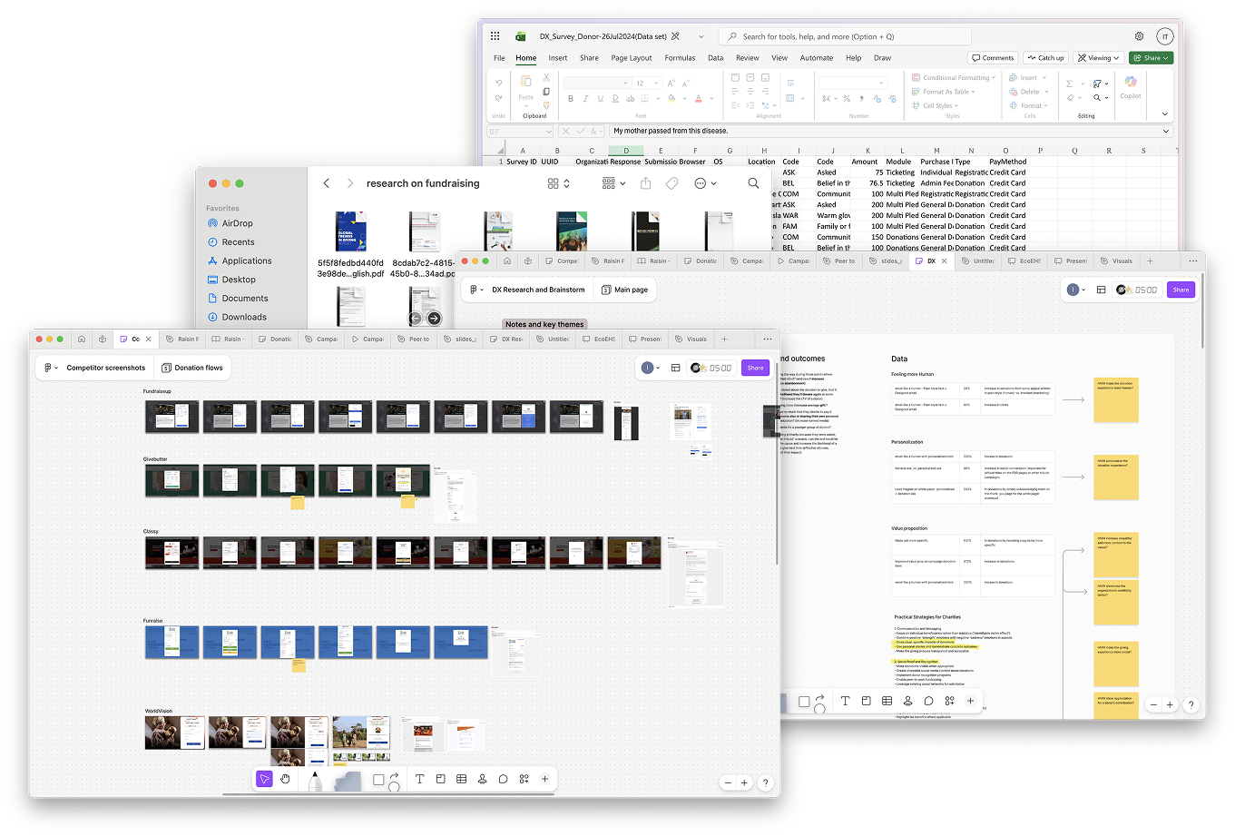
I started with a donor survey asking a simple question: “What motivated you to give today?” I paired this with academic literature, industry research and a competitor audit to understand what was missing from the existing experience.
Personal connection was a recurring theme. In the survey findings, 40% indicated a personal connection to the cause, and 22% said they were asked in a way that mattered to them. The written responses made those motivations much more tangible.
“Family. Both my parents needed critical care when they were ill. I hope this donation helps in making another family’s experience a little better.”
“We are first time grandparents and we would do anything to help the kids with cancer! We wish all the best to all the kids.”
“I know what it's like to be hungry. My family was helped when I was a child so I try to keep giving to community organizations such as yours.”
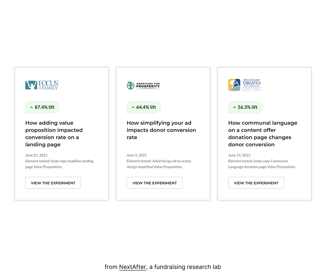
I also looked at industry experiments on how organizations communicate with donors. These examples helped inform the direction; they were evidence from other contexts, rather than a prediction of the results we would see at raisin.
Meanwhile, the competitor audit showed a pattern: donation forms focused heavily on completing the transaction, with less attention to storytelling or visual engagement. The opportunity was to help each organization express what made its cause meaningful to its supporters.
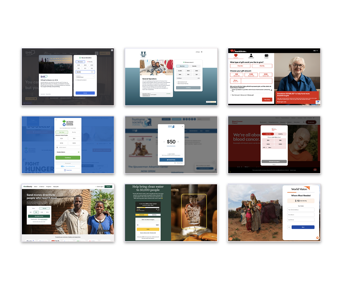
Giving each cause room to tell its story
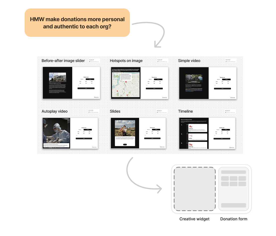
I framed the design question around the organization: how might we make donations more personal and authentic to each cause?
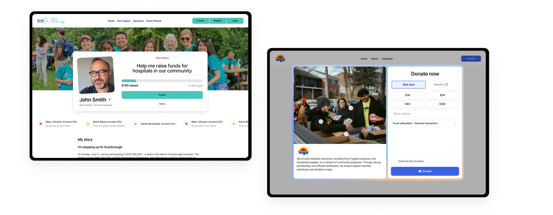
I explored a donation form paired with a configurable storytelling area. We called these creative “widgets”: an organization could use a video, an image comparison, a timeline or another format to show what a donation makes possible.
The goal was to give organizations options that fit their campaign. A single visual treatment would not capture the range of causes and donor motivations we had seen in the research.
Testing the direction
I tested the concepts through preference testing with the general population in Maze, a client survey and qualitative client interviews. This gave us feedback from potential donors as well as the organizations that would use the tools.
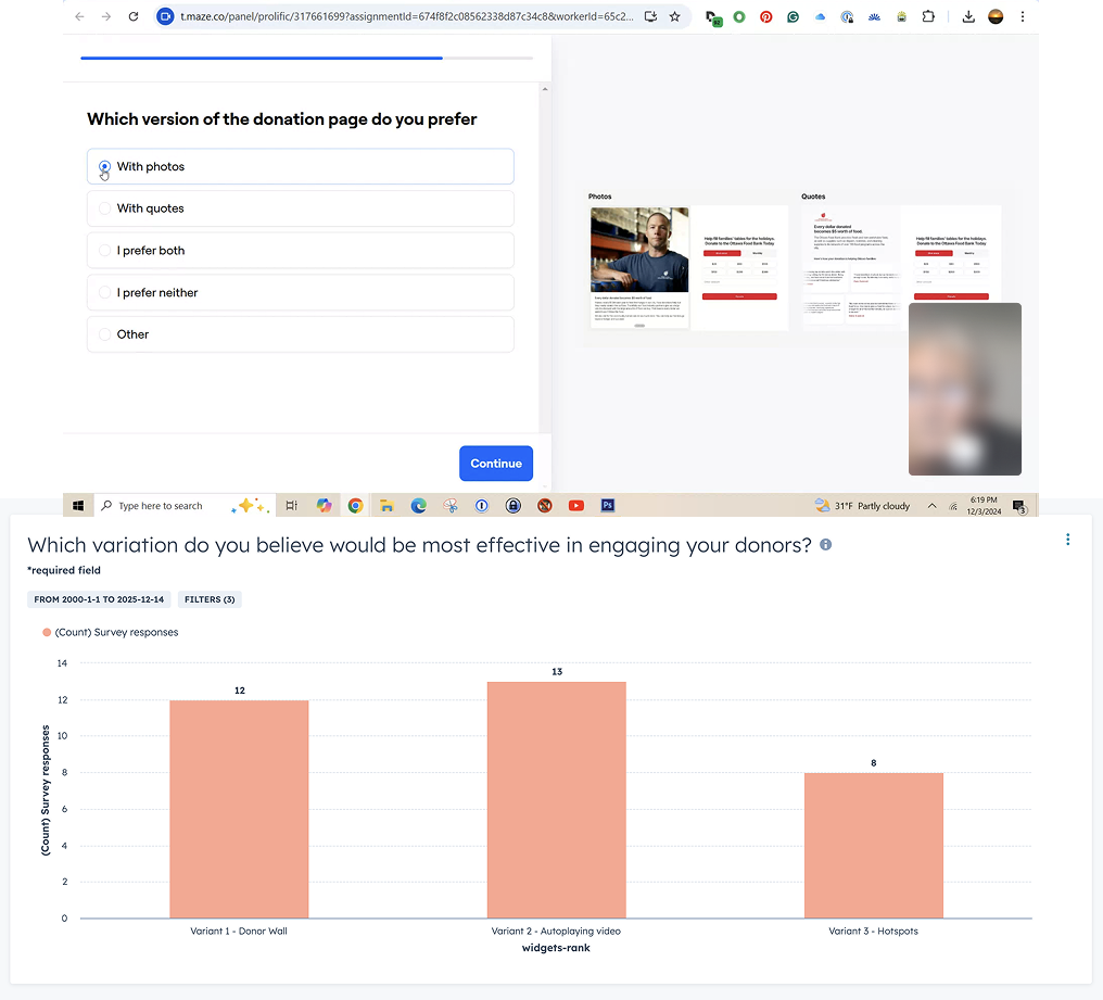
Some creative treatments were preferred over others, but the broader learning was that different formats could suit different campaigns. The ability to experiment with those formats became an important part of the product direction.
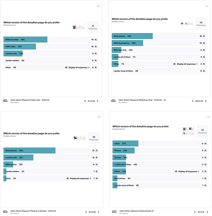
We still had two open questions: would those preferences translate into more completed donations, and would a multi-step form improve conversion? Preference testing helped us choose a direction; the beta would let us investigate actual behaviour.
Balancing the story with the task
The most useful design feedback challenged the central idea: as donors progressed through the form, the creative content became distracting. Something that could help someone connect with a cause at the start could compete for attention when they needed to enter their details.
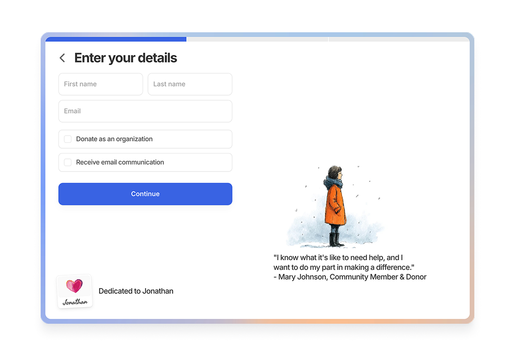
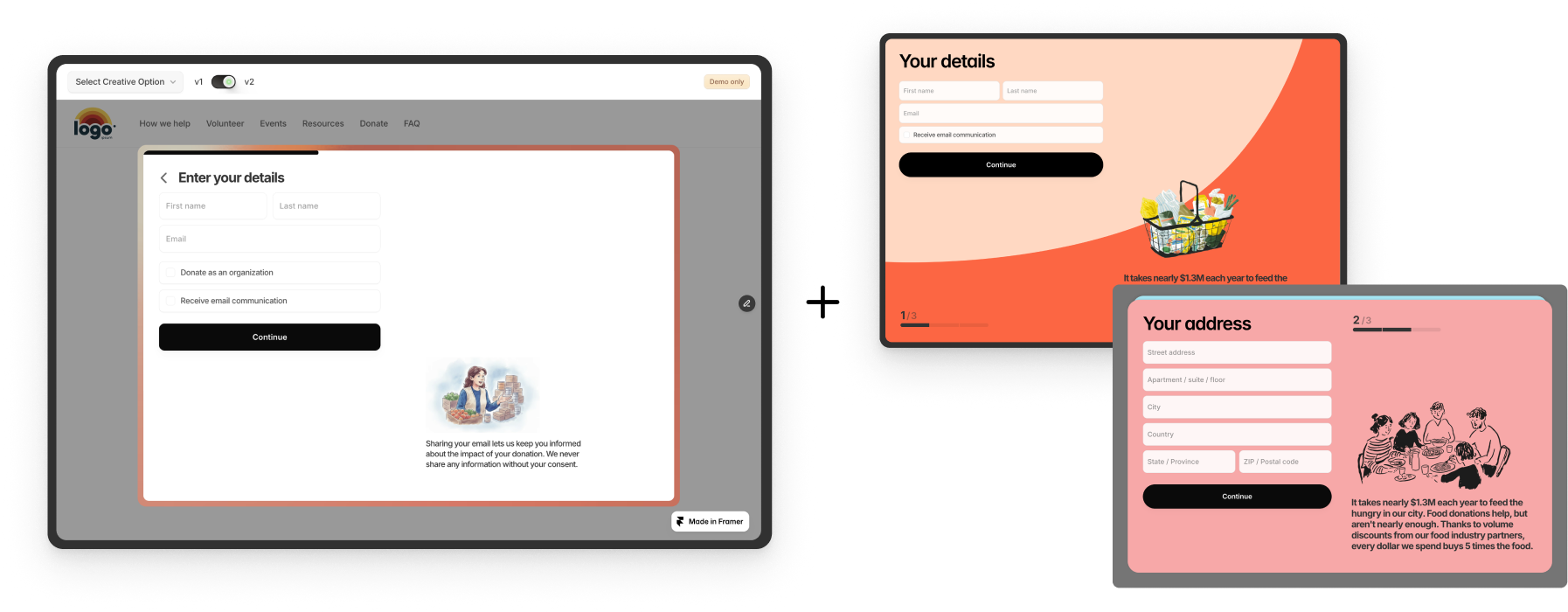
I adjusted the later steps to bring the form into focus, replacing the large storytelling panel with a smaller illustration and supporting message. This kept a sense of personality while giving the donor a clearer task.
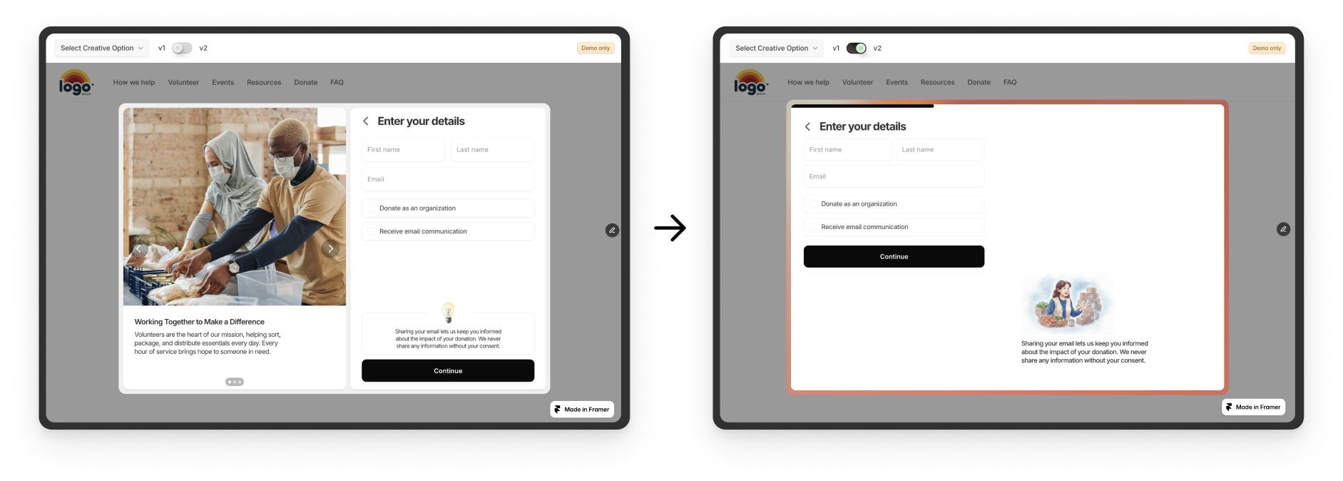
We also heard that the form itself needed to feel more distinctive. I explored how colour, illustration and impact messages could carry the organization's personality into the form, even when the larger creative widget was no longer present.
Building towards the vision
The brief-to-testing work took three months. The beta took longer to build, giving us a way to test the new form format while the back-end work for the full product continued.
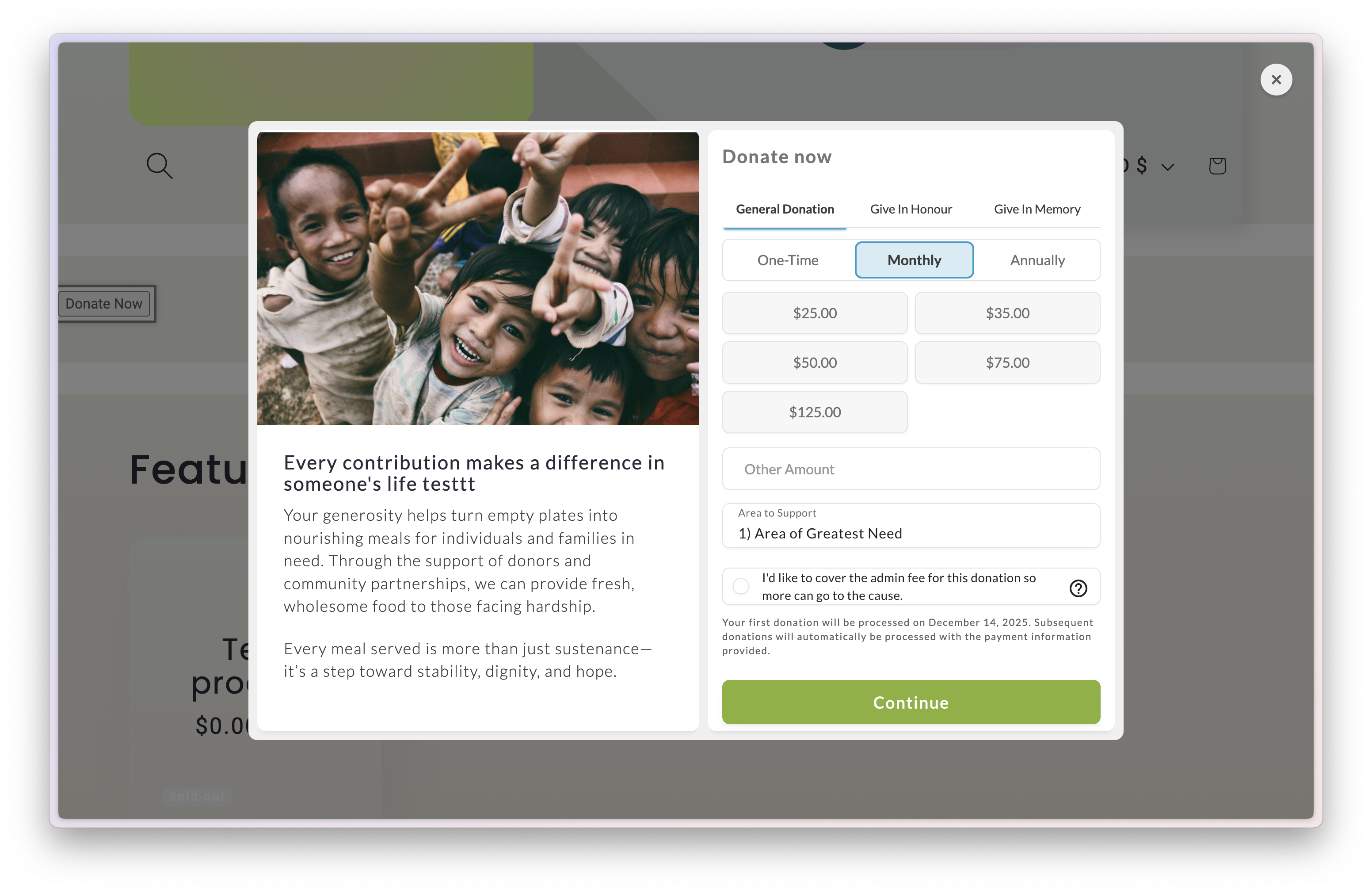
I presented our plans and vision to clients in a company webinar. The feedback gave us an early signal that the direction resonated, both as a reason to stay with raisin and as a more thoughtful experience for donors.
“This reaffirmed our choice in raisin and made us feel comfortable and confident in continuing to use raisin long term. The alignment is amazing and we are so excited for all the things 2026 is going to bring to the platform”
Client feedback after the roadmap presentation
“Any opportunity to surprise and delight – make memories, convey personality, that stuff matters. I loved that the little thank you message at the end of the donation flow was on a skeuomorphic note. We all know that it’s not actually handwritten but our brains deep down see that and think that there was care involved in that.”
Client feedback after the roadmap presentation
At this stage, the outcome is a tested product direction, client confidence and a beta to learn from. We have not yet established an increase in donation conversion.
Reflections
- This project reinforced that an idea can be useful at one point in a journey and distracting at another. The storytelling needed to adapt as the donor moved from considering a gift to completing it.
- Designing for a range of causes meant giving organizations room to experiment. The value of the concept was in helping them find a format that worked for their own story.
- Positive feedback helped us move forward, but it left an important question open. The next step is to understand how the experience affects completed donations, beyond what people say they prefer.