EcoEHS Mobile App Redesign
How we simplified the reporting experience for front-line workers and increased the mobile engagement metric by 28%.
Role
Senior Product Designer
Timeline
3 months
Year
2024
TLDR
I led the redesign of EcoEHS's mobile app, focusing on simplifying the reporting experience for frontline workers. I identified and prioritized key focus areas along the customer journey. I then created and validated a new experience, working closely with the development team to deliver the solution.
By prioritizing assigned tasks and ad-hoc reporting, we increased number of records created on a mobile device by 28%. Here's what some of our customers had to say about the new design:
Making Safety Intuitive for Front-line Workers
EcoOnline EHS is a safety management software designed to increase visibility and reduce workplace hazards and incidents. In 2024, one of our primary objectives was to boost product adoption among frontline workers. This focus was driven by two key factors: frontline adoption is a significant challenge in implementing safety programs, and ease of adoption is a crucial purchasing factor for prospective buyers.
Our bet was that increasing mobile participation among the field workers was the key to driving the organizational adoption.
At the time, the EcoEHS mobile app was underperforming. It was a web-view wrapper aiming for feature parity with the desktop application, with some pages not fully responsive or supported on mobile devices.
Uncovering User Needs
I began by identifying the key workflows relevant to frontline users. The process included:
-
Auditing the existing user journey
-
Analyzing feedback from the customer ideas portal
-
Reviewing over 1,000 CSAT (Customer Satisfaction Score) survey comments
-
Analyzing previous user interviews
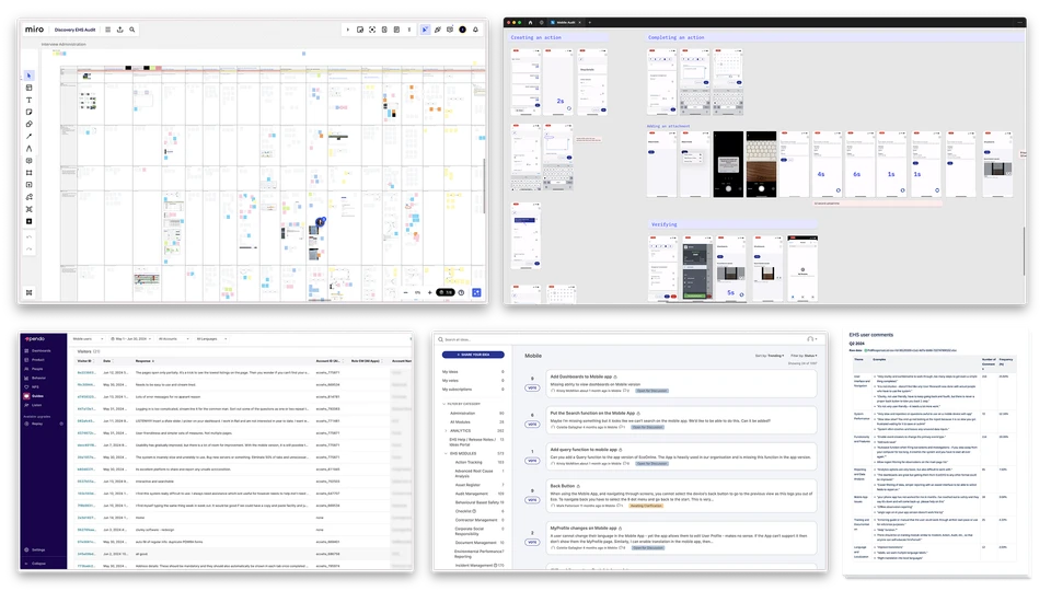
Research artifacts - UX Audit, Interview Notes, Ideas Portal, CSAT comments
One of the key problems we identified was that the app was unnecessarily complex for front-line workers' primary use case and lacked a cohesive starting point. Users were unclear about what they needed to do when they logged in.
"Clunky" was one of the first words customers used to describe their experience.
“The app is too complicated to use quickly along daily work routine”
“Clunky, not user friendly, have to keep going back and fourth”
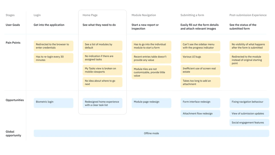
I mapped the front-line worker's user journey, highlighting pain points and opportunities uncovered during the research stage.
Targeting the Home Page Experience
There were many opportunities to improve the experience throughout the journey, but there were equally as many constraints. To prioritize our focus areas for the project, I facilitated a value/effort matrix exercise with the Product Manager and Tech Lead. Based on this discussion, we decided to revamp the home experience of the app.
We hypothesized that the two most important workflows for front-line workers were seeing tasks and inspections assigned to them and creating ad-hoc reports. Our bet was that we could enable both of these flows from the front page of the app, reducing the time to value and simplifying the experience.
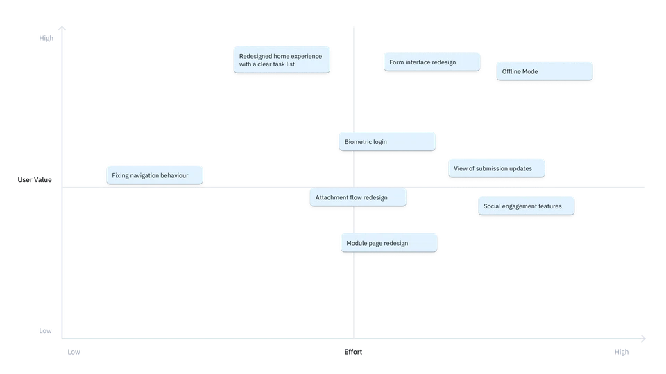
I facilitated a value/effort matrix exercise with the PM and Tech lead
Creating a vision and working backwards
As a product trio with the PM and the development manager we came up with a vision of the new mobile experience.
We decided to re-use an existing page in the product called My Tasks for this experience, which showed the work assigned to the user. However, it was underutilized as the task list lacked clarity and the UI was broken a mobile screen.
We worked backwards with the development team to get to the final point in iterations, starting with the most obvious fix of making the My Tasks page responsive
To support this experience, we had to overcome some technical challenges:
-
We created a new setting for a mobile-only landing page, with My Tasks as the default, to work around the existing configurable home page setting.
-
We improved navigation patterns, fixing the behavior to return users to their original location after closing a form, rather than redirecting them to the form's module.
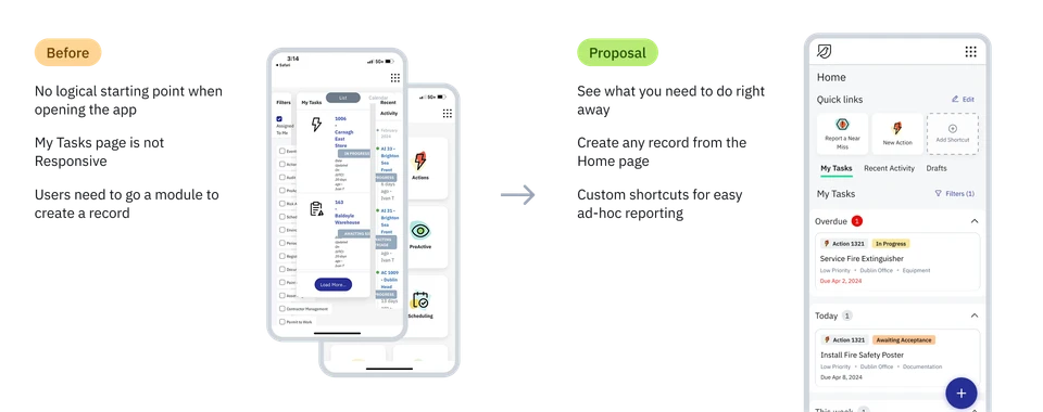
Our original vision for the home experience
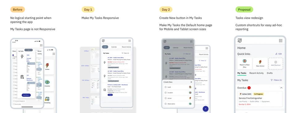
Working in iterations towards the final vision
Hypothesis testing
We tested our concept prototype with internal stakeholders and customers, focusing on two main elements:
-
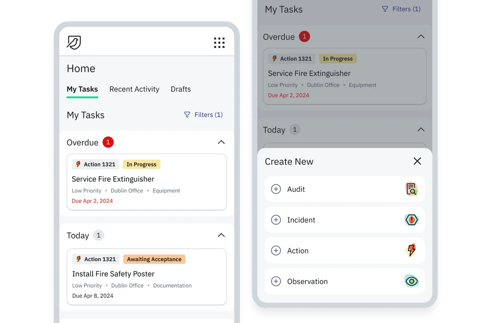
A redesigned My Tasks UI, grouping assigned tasks by date and highlighting overdue items.
-
Shortcuts (Quick links) allowing users to immediately start a new form, pre-selecting the type of form and template.
We collected feedback from existing mobile customers through an in-app survey and a moderated prototype test.
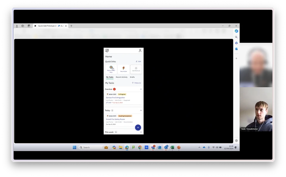
I facilitated five usability tests with mobile users to get feedback on the new homepage
Key Takeaways
Both the redesigned view and shortcuts received positive feedback. However, the clear takeaway was that an improved task view was the most critical functionality. Users strongly desired a seamless starting point with a clear view of their most important tasks.
Given our time constraints and to ensure successful project delivery, we decided to remove the shortcuts concept from the scope.
Impact
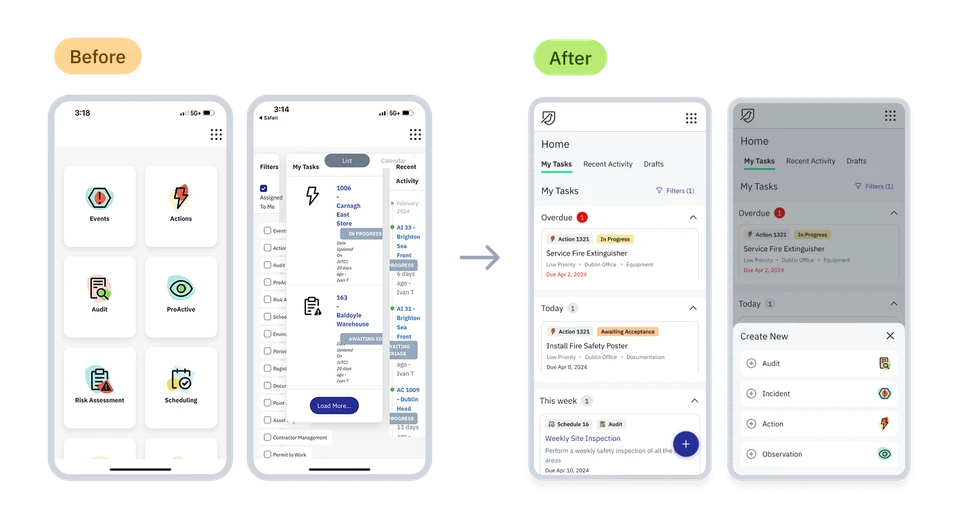
Final before and after - we redesigned the My Tasks view and made it the default homepage
As the project is just beginning its rollout phase, we don't have all of the metrics finalized. We are primarily tracking two key targets: mobile engagement, measured by the number of records created on a mobile device, and user satisfaction through CSAT scores.
Early data is promising, indicating a significant 28% increase in the number of records created on a mobile device.
Qualitatively, we've achieved significant impact by reducing complexity and providing front-line users with a tangible starting point in the app. This improvement eliminates friction in app adoption, making safety reporting easier and more intuitive.
Reflections
-
This project is an important reminder that user experience goes beyond the UI layer and “how things look”. Making sure we provide users with good defaults and familiar navigation behaviours was key to creating the right experience for mobile users.
-
An outcome based approach is a great way to speed up the value delivered to users. We were able to deliver this project in milestones, gradually building towards the final vision. This allowed us to move more quickly and collect feedback along the way ensuring we were on the right track.